
Matplotlib#
The mathematician Richard Hamming once said, “The purpose of computing is insight, not numbers,” and the best way to develop insight is often to visualize data. Visualization deserves an entire book of its own, but we can explore a few features of Python’s matplotlib library here. While there is no official plotting library, matplotlib is the de facto standard. You’ll see lots of matplotlib use throughout this book.
By the end of this notebook, you’ll be able to:#
Create plots using
matplotlib.pyplotManipulate aspects of plots
Plot multiple graphs in a single figure
Setup#
First, let’s get set up for plotting by importing the necessary tool boxes. Below, we will import the pyplot module from matplotlib as plt.
# Import matplotlib pyplot, our main plotting module
import matplotlib.pyplot as plt

print('Plotting packages imported.')
Plotting packages imported.
Create & Plot a Random Line#
First, let’s create a random line using our favorite scientific computing toolbox.
# Import numpy
import numpy as np

# Generate a random line from 1 to 100 with 100 values
random_line = np.random.randint(1,100,100)
Now, we can use matplotlib.pyplot module (imported as plt above) to plot our random line.
Useful functions:
plt.plot()create a plot from a list, array, pandas series, etc.plt.show()show the plot (not strictly necessary in Jupyter, necessary in other IDEs)plt.xlabel()andplt.ylabel()change x and y labelsplt.title()add a title
# 1 - Plot the data
plt.plot()

# 2 - Change plot attributes


# 3 - Show the plot
plt.show()
Create & plot a histogram#
The plt.hist() function works really similarly (see documentation here).
Generate a random list of 100 data points from a standard normal distribution (Hint: Use
np.random.standard_normal(), documentation here).Plot a histogram of the data.
# Generate your plot here
Subplots#
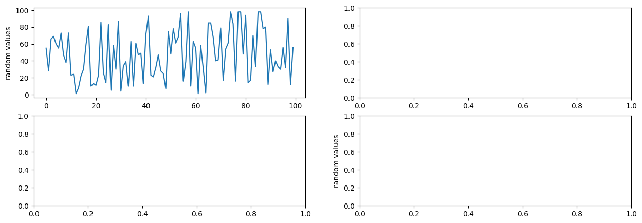
We can also set up multiple subplots on the same figure using plt.subplots(). This also creates separate axes (really, separate plots) which we can access and manipulate, particularly if you are plotting multiple lines. It’s common to use the subplots command for easier access to axis attributes.
# Get information about subplots
plt.subplots?
Side Note: We can assign two things at the same time!
a , b = 2 , 3
print(a)
print(b)
2
3
Below, we’ll generate our figure with multiple subplots.
# 1 - Generate a figure with subplots
fig, ax = plt.subplots(2,2,figsize=(15,5))

# 2 - Plot our line on the first axis, [0,0]
ax[0,0].plot(random_line)

# 3 - Update axis parameters
ax[0,0].set_ylabel('random values')

# 4 - Update general plot parameters
plt.ylabel('random values') # Compare what this does versus ax.set_ylabel

plt.show()
There are many, many different aspects of a figure that you could manipulate (and spend a lot of time manipulating).
Style guides help with this a bit, they set a few good defaults. Below, we are setting figure parameters, and choosing a figure style (see all styles here, or how to create your own style here.)
You can test how these parameters change our plots by going back and re-plotting the plots above.
# Import package that allows us to change plot resolution & default style
import matplotlib as mpl

# Set the figure "dots per inch" to be higher than the default (optional, based on your personal preference)
mpl.rcParams['figure.dpi'] = 100

# (Optional) Choose a figure style
print(plt.style.available)
plt.style.use('fivethirtyeight')
['Solarize_Light2', '_classic_test_patch', '_mpl-gallery', '_mpl-gallery-nogrid', 'bmh', 'classic', 'dark_background', 'fast', 'fivethirtyeight', 'ggplot', 'grayscale', 'petroff10', 'seaborn-v0_8', 'seaborn-v0_8-bright', 'seaborn-v0_8-colorblind', 'seaborn-v0_8-dark', 'seaborn-v0_8-dark-palette', 'seaborn-v0_8-darkgrid', 'seaborn-v0_8-deep', 'seaborn-v0_8-muted', 'seaborn-v0_8-notebook', 'seaborn-v0_8-paper', 'seaborn-v0_8-pastel', 'seaborn-v0_8-poster', 'seaborn-v0_8-talk', 'seaborn-v0_8-ticks', 'seaborn-v0_8-white', 'seaborn-v0_8-whitegrid', 'tableau-colorblind10']